Workspace Design

Working From Home? We Have You Covered. Design Special: $575 Home Office Plan by Mackenzie Collier

Times are tough right now. Coronavirus putting the world under quarantine has many of us going stir-crazy. Those who are fortunate enough to be able to work from home may be finding it difficult to function the same. That’s where we come in.

We want to provide you with a space that is fun and FUNctional. An environment where you can get work done from the comfort of your own home. For a limited time, we’ve got a special design plan to help you spruce things up. For $575, you’ll get a custom curated plan for your space in just 1-2 weeks.

Included but not limited to: hardworking parents + individuals, hustling college students, cool grade-school kids. ;)

Here is what a home office design process would look like…

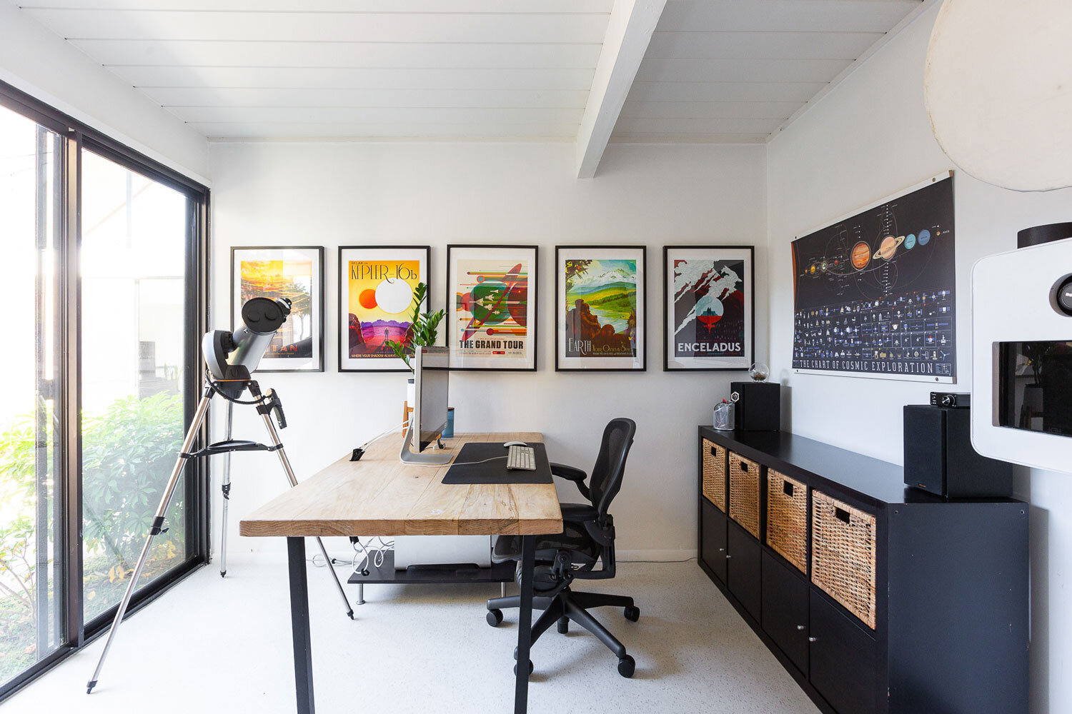
Go Fit Jo Home Office

Video Consult

Discuss your work-from-home needs + wishes for the space with one of our awesome designers.

[Image: Go Fit Jo; Keith Haring Wallpaper: Blik; Desk: Ikea]

Mid Century Home Office

Custom Color Palette

To make sure we’re heading in the right direction, we’ll send a custom color palette your way for feedback + approval.

[Image: James Stewart Photography; Desk: West Elm]

Alivia Fields Portland Oregon Apartment

Design Concept Page

Items we’ve sourced for your working space:
Furniture
Art
Lamps
Accessories

[Image: Alivia Fields]

Modern Home Office Storage

Shopping List

A digital document of our curated selections. Just click & order.

[Image: James Stewart Photography; Desk: Crate and Barrel]

Go Fit Jo Bay Area Home Office

Pinterest Board

A link where you can see other items we considered durning the process.

[Image: Go Fit Jo; Storage: Ikea]

Desert Luxe Home Office

FIN

Now you have a space to get productive work done! Take that, COVID-19!

[Image: Roehner + Ryan; Chairs: Restoration Hardware; Desk: Anthropologie]

Again, this is a limited time offer, so jump on it! Give us a call to learn more: 602-529-2191

Old Town Scottsdale Office Space Reveal by Mackenzie Collier

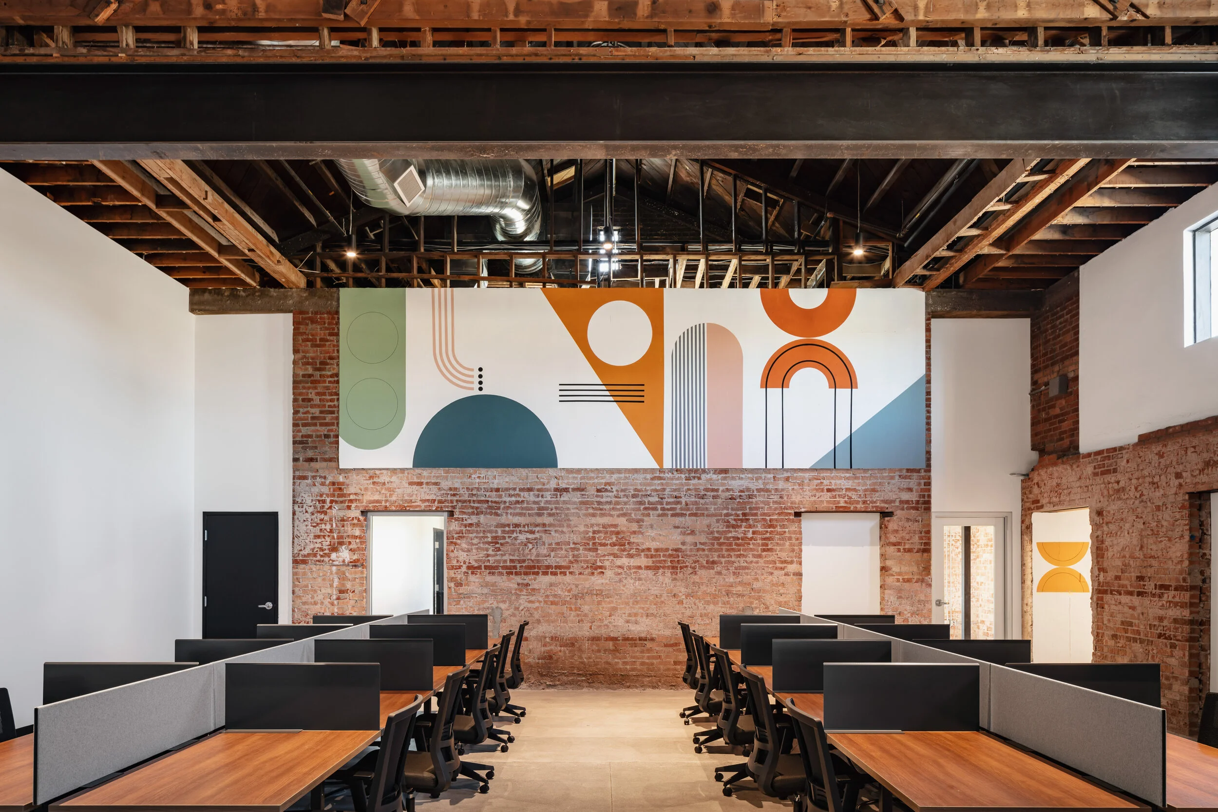
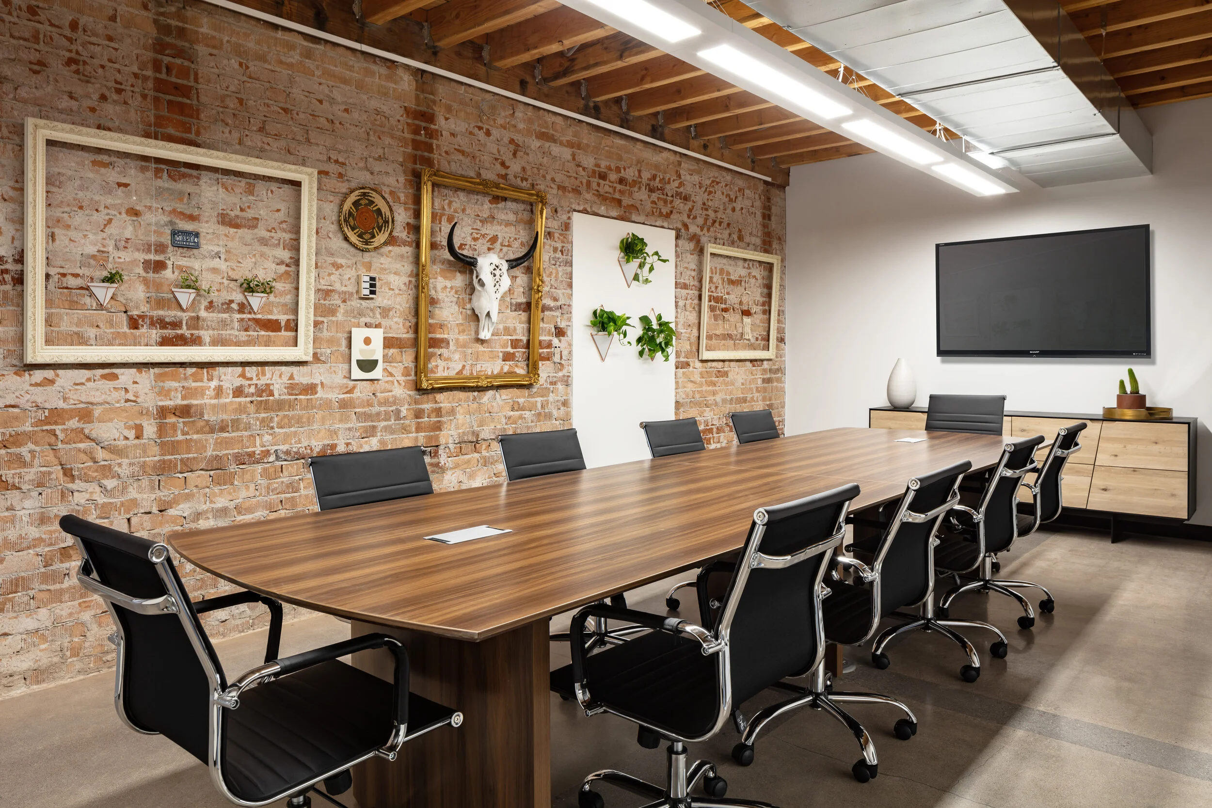
To reveal our latest design, we asked our Senior Interior Designer, Aleah Carr to answer some questions about her design process for this project. Here are her thoughts on the design challenges, inspiration and how to create a “resimercial” space for our client within a church that was built in the 1950’s!

What was the inspiration behind the design?

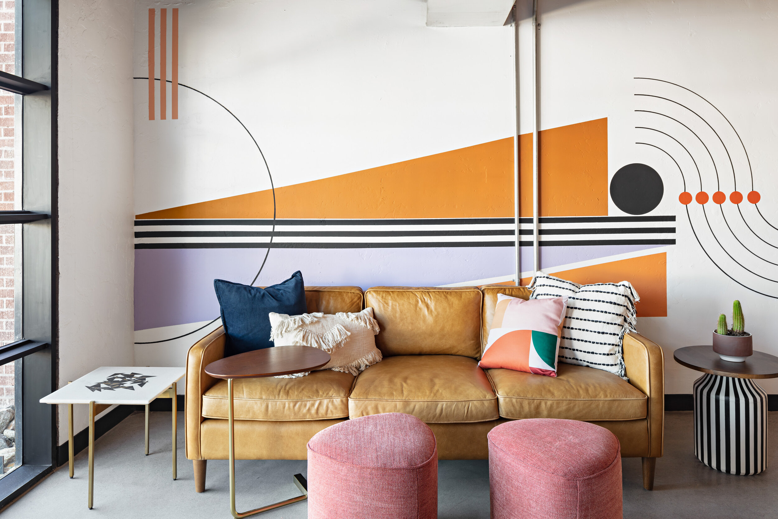
Inspiration for this space came directly from the state of Arizona. Our Tel-Aviv based client specifically asked for a space that had a residential vibe and felt like home. They wanted to create an environment so nice it would inspire their employees to not only respect the space but, ultimately, get them excited to come to work. We layered a lot of natural materials wood, rattan, and marble then amplified the impact with bold hues and unusual textiles throughout. We also aimed to make a big impact with found objects, vintage mid-century pieces, organic textures and design features created by local artists.

What was your favorite space and why?

My favorite space definitely has to be the entry. The rope feature created by the very talented local textile artist, Taylor Crockett, makes such a huge impact before you even get the chance to see the rest of the space. The idea here was to separate the spaces in an unconventional way without obstructing the view. The bold patterns and hues of the rope feature immediately catch your eye and get you excited for what’s to come on the other side. In addition to the rope feature, we created small seating areas within the entry that truly give you a residential vibe which was the exact direction we were heading. I’m dying to have that leather chair in my own home now!

What was the greatest design challenge?

The biggest challenge at hand was definitely the mixing of commercial and residential design. How do we create a space that has a residential aesthetic without sacrificing the quality and durability necessary for a successful commercial setting? We found a perfect balance between the two by finding some pieces that were commercially rated but had a residential look. We also opted for more durable fabrics like leather and performance velvet rather than going with textiles that wouldn’t stand the test of time. It was definitely difficult to curate, but I think we were successful.

Why did you choose to incorporate vintage pieces into this workspace?

Have you ever seen a piece of furniture and just knew it was the one? Well that’s how I feel about MOST vintage furniture and we were lucky that our client totally agreed. Not only is it a unique way to incorporate sustainability (reduce-reuse-recycle), but the quality of vintage furniture is so much better than that of newer items making it last so much longer so you can share it with the world for a long time. I hold a very special place in my heart for vintage pieces, especially after having learned so much about them in college.

What does the term “resimercial“ mean?

Resimercial is a totally new term in the design world. It means to blend two opposite design appoaches— commercial and residential. In my mind, resimercial design is where the two worlds meet to create workspaces that are homey and cozy but still functional and professional. It’s a more casual way to work that also increases productivity and, in the long run, gets people excited to come to work. You do spend more time at work than at home, so why not make it a space that you are thrilled to be in?